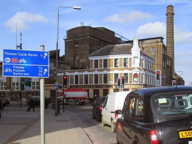
The Dutch design cycle routes to be safe, direct, comfortable, attractive and cohesive. Excellent signage is recognised as a vital aspect of cohesive routes.
One of the biggest flaws in London's existing cycle routes is the use of long signs that are strapped onto round poles. I suspect they're cheap, but it is a classic example of a false economy since they don't work.
Today I was asked for directions right next to these signs.
I checked my map, gave directions, then wrestled with one of the signs to make it point the right way, at least until the next windy dayA little earlier in the day I was on the cycle route, below
which now looks like this (and will do until the wind blows again)
I hope the new London Cycling Design Standards will lead to the replacement of these signs with ones that are more resistant to swinging around. In the meantime it would probably make sense for the Mayor of London to employ a person just to cycle around London constantly checking and adjusting the signs.


